
How to Choose a Watch Dial Color to Match Your Outfit?
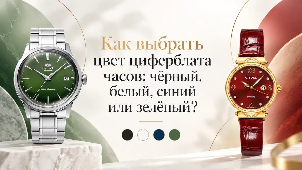
How to choose a watch dial color: black, white, blue or green?
The color of the dial strongly affects how a watch looks on the wrist and what clothing it is easiest to pair with.
Some colors are highly versatile and suitable for almost every day, while others make the watch a noticeable part of the overall look.
At WATCHZ, four main colors are most commonly represented:
black, white, blue and green.
But there are also more expressive options — gold, red, pink and others.
The main rule is simple:
it is better to choose a dial color not only because you like it on its own, but also with consideration for the clothes you wear and where you plan to use the watch.
White dial — classic and versatile
A white or light-colored dial is one of the calmest and most versatile options.
It pairs well with:
- a white or light blue shirt;
- a suit;
- light-colored clothing;
- beige and gray tones;
- classic and smart casual style.
Men’s example:
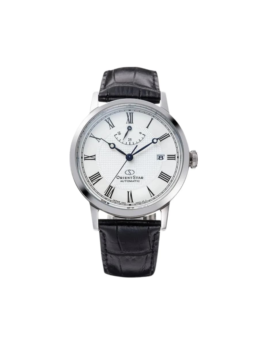
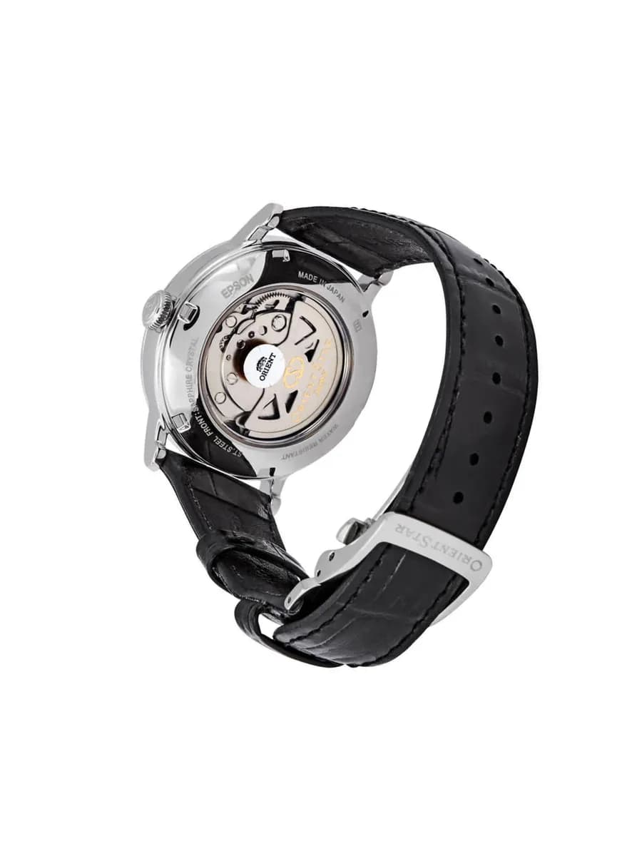
Orient Star RE-AU0002S00B
9 150 000 UZS
Women’s option:
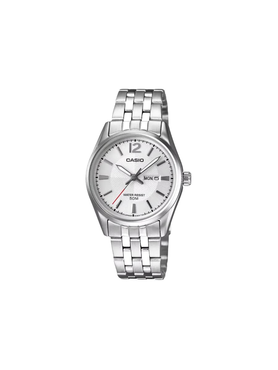
Casio LTP-1335D-7AV
771 000 UZS
A white dial visually makes a watch look lighter and cleaner. It works especially well on classic models.
When to choose: for the office, a suit, business meetings or if you need highly versatile light-colored watches.
Black dial — strict and practical
Black is one of the most versatile colors in watches.
It pairs well with almost everything:
- black clothing;
- gray;
- white;
- dark blue;
- jeans;
- business wardrobe;
- casual.
Men’s Casio:
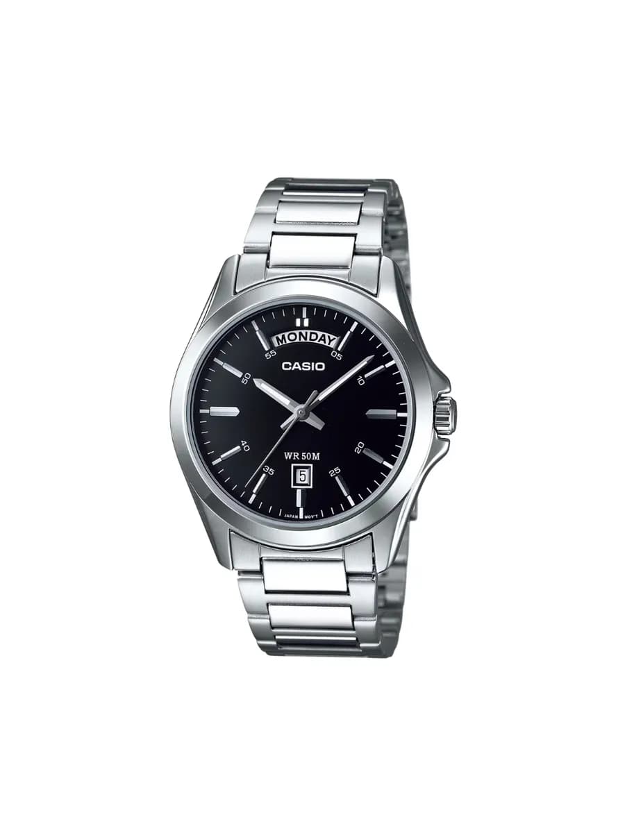
Casio MTP-1370D-1A1
825 000 UZS
Women’s Beverly Hills Polo Club:
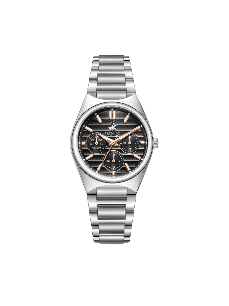
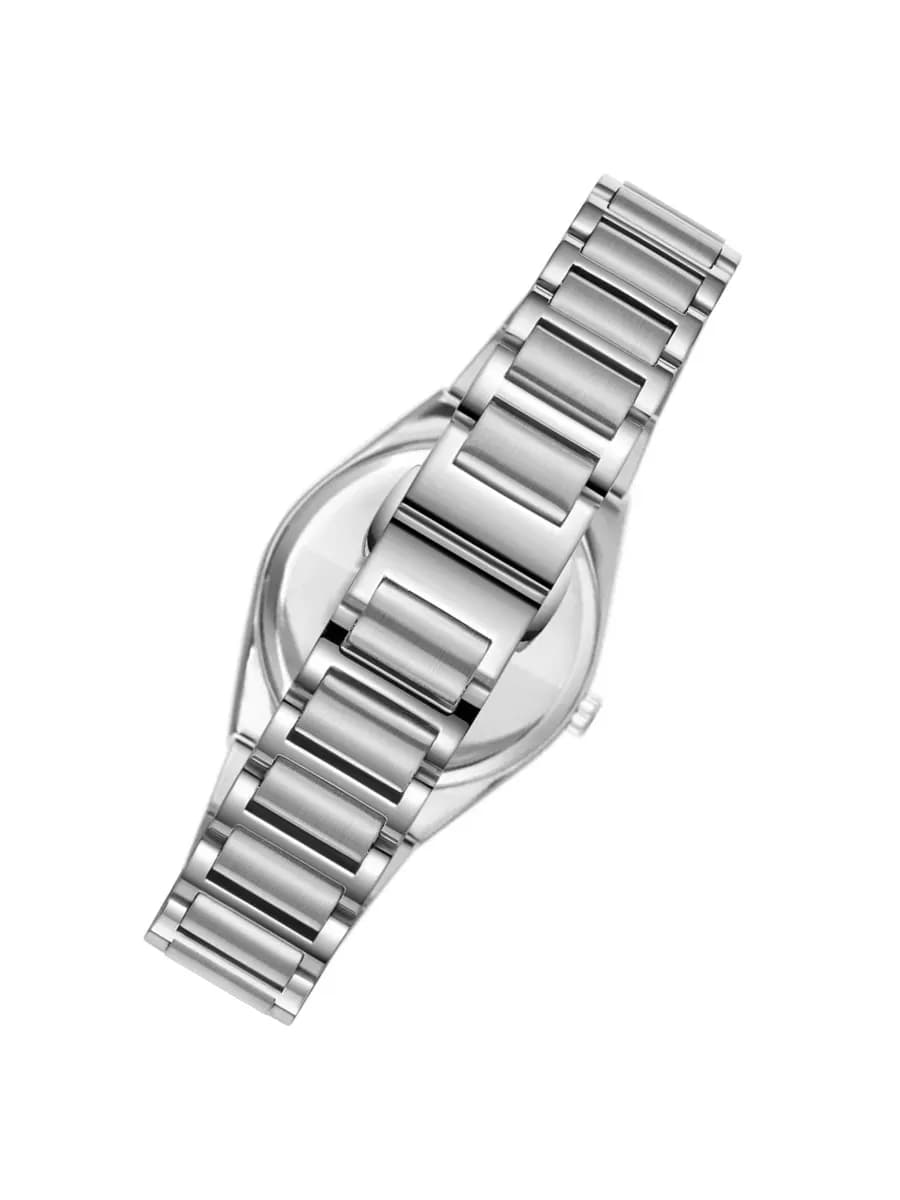
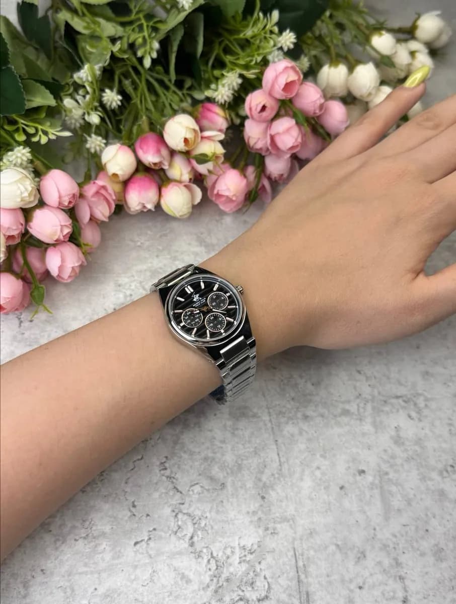
Beverly Hills Polo Club BP3746C.350
1 775 000 UZS
A black dial usually makes a watch look visually stricter and more contrasting. On sports models it emphasizes a technical character, while on classic models it adds restraint.
When to choose: if you need one watch for most situations and want a dark, neutral option.
Blue dial — versatility with character
Blue occupies an interesting position between classic and bright colors.
It is more noticeable than black or white, while still remaining quite versatile.
Blue pairs especially well with:
- a white shirt;
- blue and gray suits;
- jeans;
- beige clothing;
- dark blue elements in the wardrobe.
Men’s Atlantic:
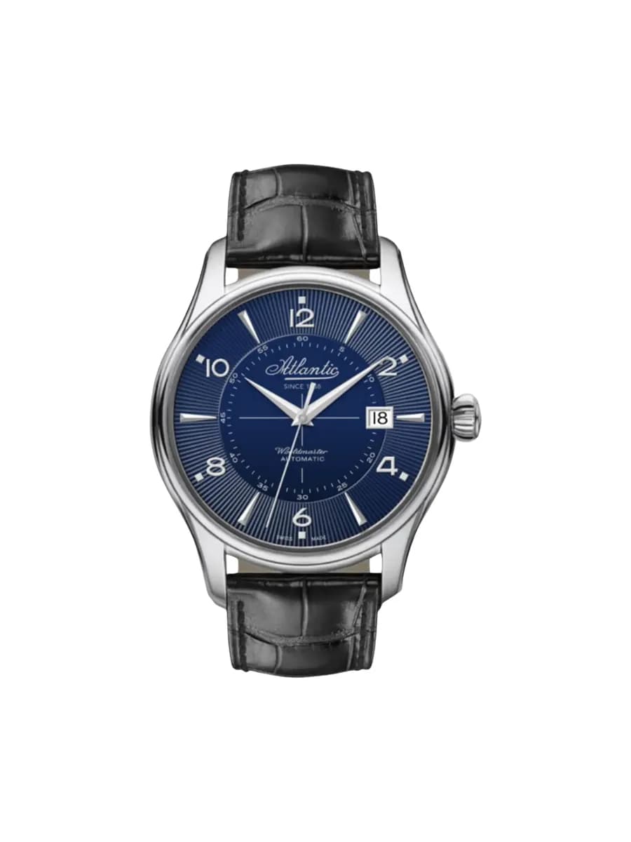
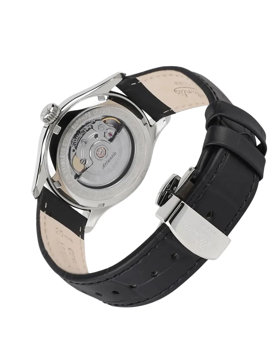
Atlantic Worldmaster Vintage Edition 55750.41.55S
12 025 000 UZS
Women’s Citole:
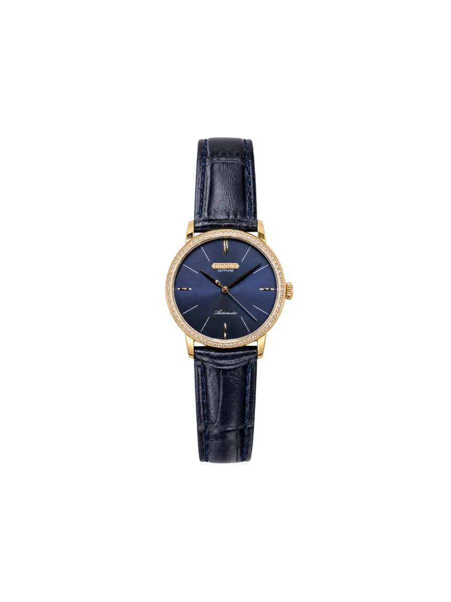
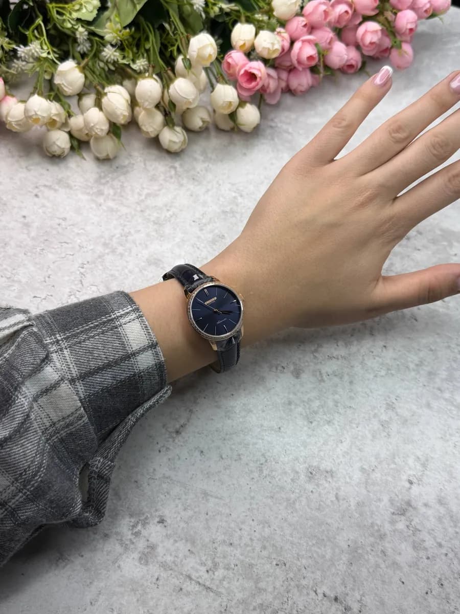
Citole Ladies Automatic CT9105LUUR
2 137 500 UZS
A blue dial looks especially interesting in different lighting: the saturation of the color can visually change, making the watch appear more dynamic.
When to choose: if you want a versatile watch, but black feels too strict and white too classic.
Green dial — a noticeable accent
Green dials have become much more popular and work well as an independent element of an outfit.
Men’s option:
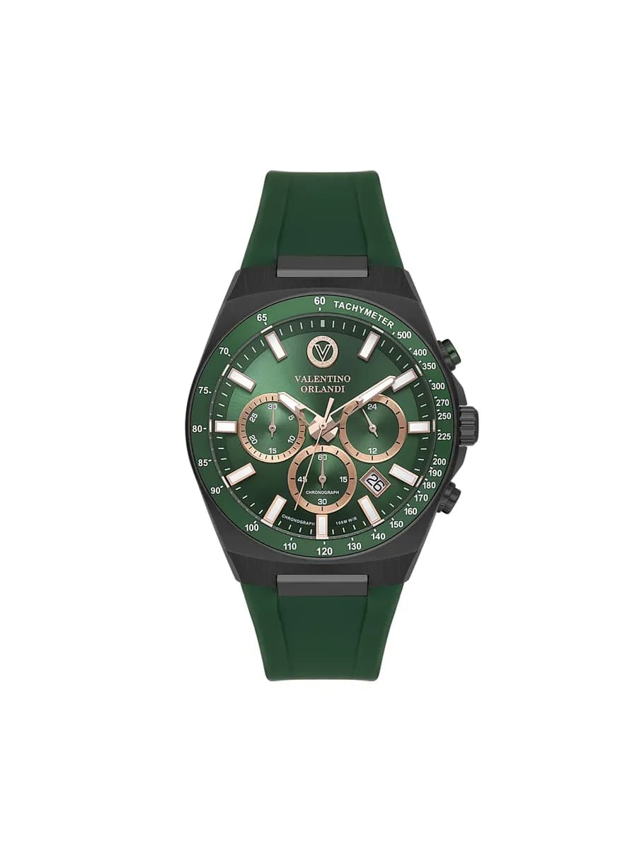
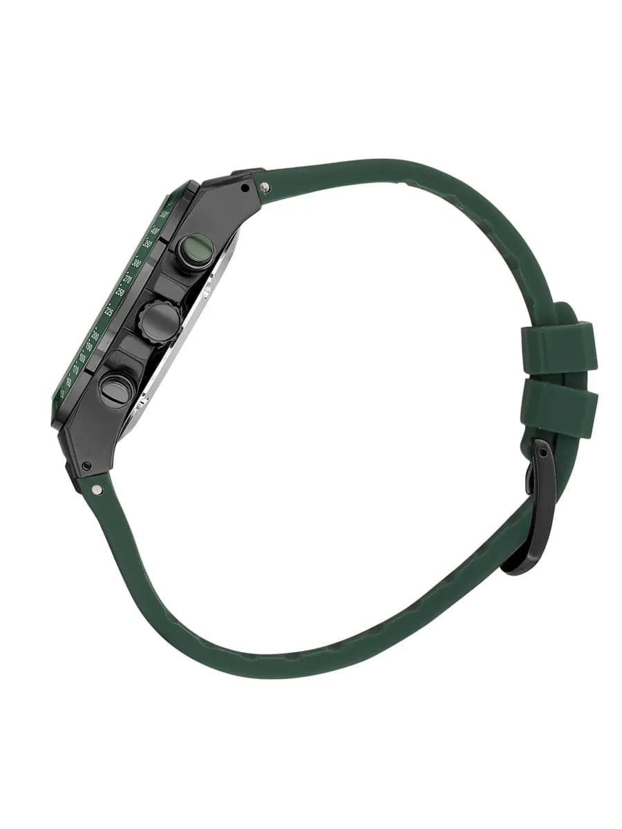
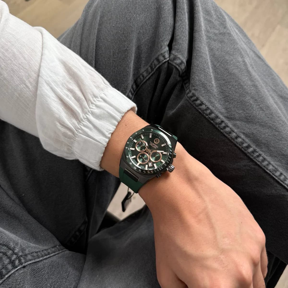
Valentino Orlandi VO.1.10017-3
3 638 000 UZS
Women’s:
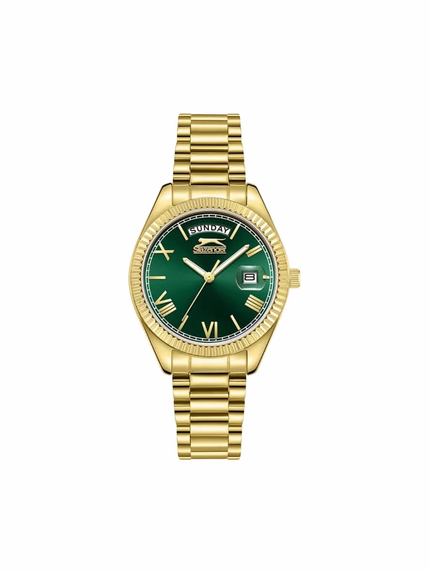
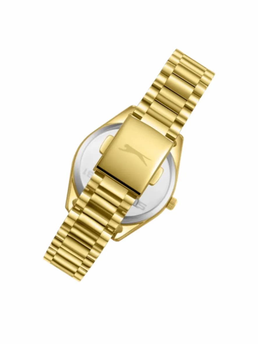
Slazenger SL.09.2338.4.05
1 150 000 UZS
Green pairs well with:
- black;
- white;
- gray;
- beige;
- brown;
- khaki and other natural tones.
At the same time, green watches are usually more noticeable than models with black, white or blue dials.
That is why there is no need to try to match them exactly to the color of your clothes.
It often works better when the green dial becomes a separate accent.
When to choose: if you already have a basic watch or want a more expressive model for everyday wear.
What about a gold dial?
Golden tones make a watch look visually warmer and more noticeable.
For example:

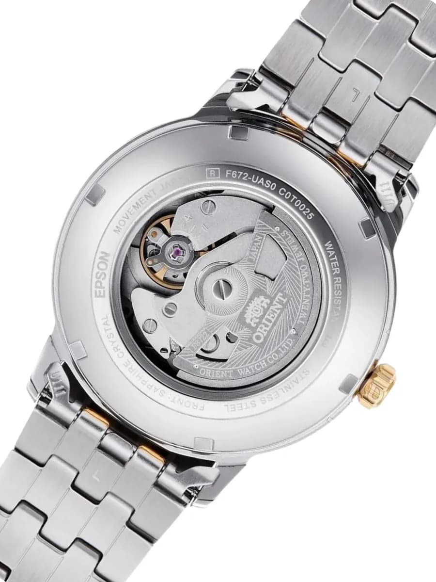
Orient RA-AC0F08G30B
4 121 000 UZS
Such watches pair especially well with:
- beige;
- brown;
- cream;
- dark blue;
- clothing in warm tones.
A gold dial usually feels more dressy, so it works well for looks where the watch should be a noticeable detail.
Red dial — the watch as an accent
Red is difficult to call a neutral color.
For example:
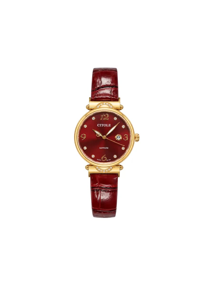
Citole Ladies CT5201LDER
1 500 000 UZS
A red dial is best treated as an accessory that is intentionally meant to attract attention.
It does not have to be paired with red clothing. On the contrary, it stands out well against:
black;
white;
gray;
beige.
When to choose: when you want the watch to be one of the main details of the outfit.
Pink dial — a light and expressive option
Pink can be either bright or fairly subtle — depending on the specific shade.
For example:
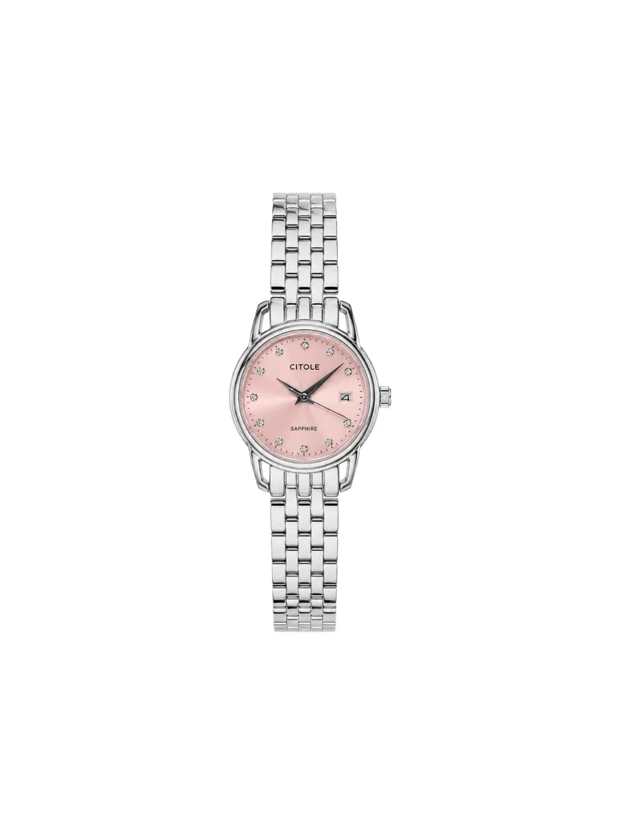
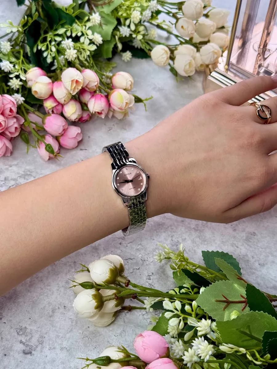
Citole CT5268LSPD
1 213 000 UZS
It pairs well with:
- white;
- beige;
- gray;
- light blue;
- pastel shades.
This option is especially interesting if the watch is being chosen not simply as a device for telling time, but as a complete accessory.
Which color should you choose for different situations?
For everyday wear — black, white or blue.
These are the most versatile options.
With a suit — white, black or dark blue.
They are the easiest to integrate into a business look.
For casual — blue or green.
They add more character while remaining quite versatile.
If the watch should be an accent — green, red, gold or pink.
If you are choosing your first watch — black, white or blue.
They are the easiest colors to experiment with when matching different clothes.